


So, I Just Completed the Complete Web Design Course by Vako Shvili on Udemy
I decided to condense all my learnings from the course in to a blog post. This is going to provide two benefits ->
Revise all my learnings
Provide value to readers & help nail their website designs.
Now let's dive straight into it.
Web Design is extremely important if you want to impress your audience as this is the first thing that catches their eye before they even start interacting.
Here're a few tips and design principles to help you design your websites for the better 👇
1)Layout is King
It all starts with alignment and a grid.
Everything that is orderly, symmetric, and organized will be perceived as more beautiful than anything that is chaotic and disorderly.
A common practice is to divide your website into a 12-column grid with a 30px gap.
2) Visual Hierarchy
Visual Hierarchy is very important. As humans, we simply can't focus on more than one thing at a time.
Only a small fraction of what we see is high definition
So, have a hierarchy for the elements in your website.
3) Optical Illusion
Beware of optical illusion.
Sometimes due to this, two objects having exactly equal dimensions appear to be of different sizes.
Eg: The square and a circle are of literally equal height and width but the square appears to be bigger than the circle.

To tackle optical illusion, you manually need to adjust the size of the objects till it pleases the eye.
Another example is when you place a text exactly vertically at the center, the text might look like it's sinking to the bottom. Make the text position a lil' up to solve this
4) Proximity
This basically means that things that are related to each other should be placed close to each other and the things which aren’t should be placed farther apart.
It makes the content easy to understand and digestible for the user making the design look prettier
5) Typography
Typography isn’t just about choosing the right font. It’s about choosing the right combination of those fonts & choosing the right typefaces, and font-weight for the right occasions.
Each typeface comes with a personality. Some are casual and friendly, some are playful while some are strict and formal.
• Most of the typefaces fall under these two caps — Serif and Sans Serif
• Others are Display(Decorative), Script.
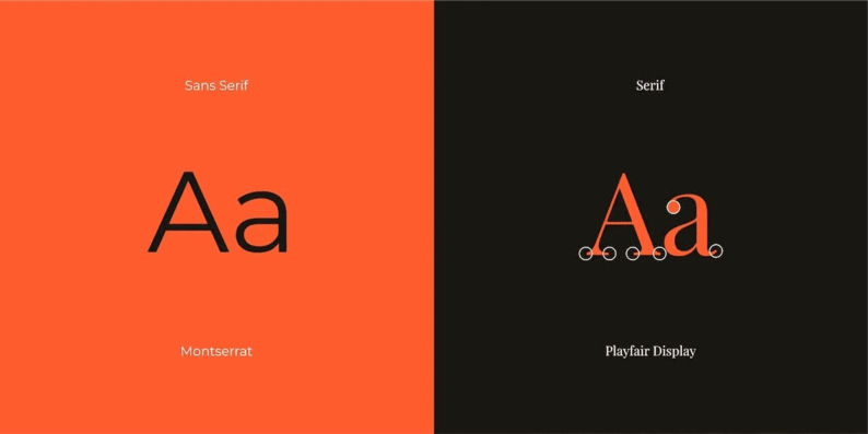
Serif Fonts are very good for displaying classical looks like restaurants, real estate, etc.
Modern Style Serif is used for fashion or luxury
Sans Serif is the font that you will most commonly be using. It gives a casual & friendly look.
Display typefaces have a good personality, but should be used carefully.
Sometimes they can become really silly. They can look like something from writing on a chalkboard to that looks really elegant.
They should never be used for paragraph text. Only for big headlines.
Protip: Whatever typeface you are using, it will come with a description by the creator/designer.
If the desc says that it is a general-purpose family, then you can use it anywhere you want. If it says display, then it simply means that it should be used for big headlines only.
6) Setting Type
INTERSTELLAR vs INTERSTELLAR
This is called the`Panorama Effect`. It is used to create more depth and curiosity with fonts. It only works well with uppercase though.
Most of the time, you will be fine using the default letter spacing.
But in case you ever wished to use letter spacing then:
• Increase spacing as the font gets smaller or lighter
• Decrease spacing as the font gets bigger or bolder
Also do consider line spacing also. Texts with good optimal line spacing are easier to read and less intimidating for the user.
As a standard for most, 37px of line spacing would be perfect.
The same above rule of letter spacing applies to line spacing.
⚠️ An Important rule to follow —> Use a maximum of 2 fonts and make sure that they look different.
Eg: Using a Display typeface for headlines and a normal sans serif for paragraph texts.
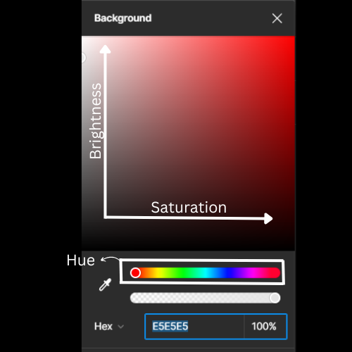
7) Sampling Colors
Most of the time, the natural world combines great color combinations. Look around yourself for great colors.
The ability to fine-tune colors is a very important skill and will help you to nail those designs
Use this tool in hsb format for better fine-tuning
8) Use Images to Create Mouthwatering Designs
A great photo can do wonders for the design.
Let's go over some techniques that make your websites mouthwatering.
Image Overlays
Sometimes you see the image can be great for the website, but the text is not in contrast with the image. To tackle this, we can use subtle black overlays on top of the images.
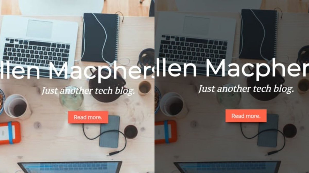
Photo Cropping
Now there’s something called extreme cropping where you crop out most of the object.
This trick is extremely helpful in giving intensified and depthful feel to your images.

9) Contrasting
Contrasting is an amazing design trick to differentiate b/w elements.
Colors Contrast - Using the almost opposite colors in the color wheel.
Text Contrast - Bold and Light Text.
Button Contrast - One button with filled color and the other is transparent.
10) White Space
White space is a trick to attract your users’ attention.
Consider Google’s website. Only a logo and search bar, nothing else to distract the users' attention.
𝗥𝗲𝗺𝗲𝗺𝗯𝗲𝗿: Good Design is as little design as possible. ~ 𝓓𝓲𝓮𝓽𝓮𝓻 𝓡𝓪𝓶𝓼
11) Repetition
The reason why repetition is a very important trick in design is because of the way we look at the world as humans.
We try to recognize patterns in and on everything that we see around us.
When we recognize a pattern, it makes us very excited & satisfied
12) Consistency.
The way to tell the difference b/w a good design and a bad design is consistency.
Alignments, Smooth/Rectangular corners, and borders are all very subtle things but inconsistencies in them will give a bad impression on the user.
Always catch 'em.
13) Lastly...Practice.
You've heard it everywhere, & it's true here also.
One of the best ways to become a good designer is to mimic the designer of professional designers.
That is it!
Hope you enjoyed reading and got value from this.
You are definitely going to nail your website designs from now on if you went through the entire blog.
I put content on Web3, Ai, and Development.
If any of the above intrigues you, make sure you follow me for valueful content.
Thank You for Reading❤️!
Make sure you drop a ❤️ and share to help the algo.
Bye 👋. Have a good day!